
Chelsea Debuts Striking Retro Crest Third Kit at Everton
Chelsea ditched their modern badge for a retro lion crest on their new third kit, debuting the striking vintage look against Everton.



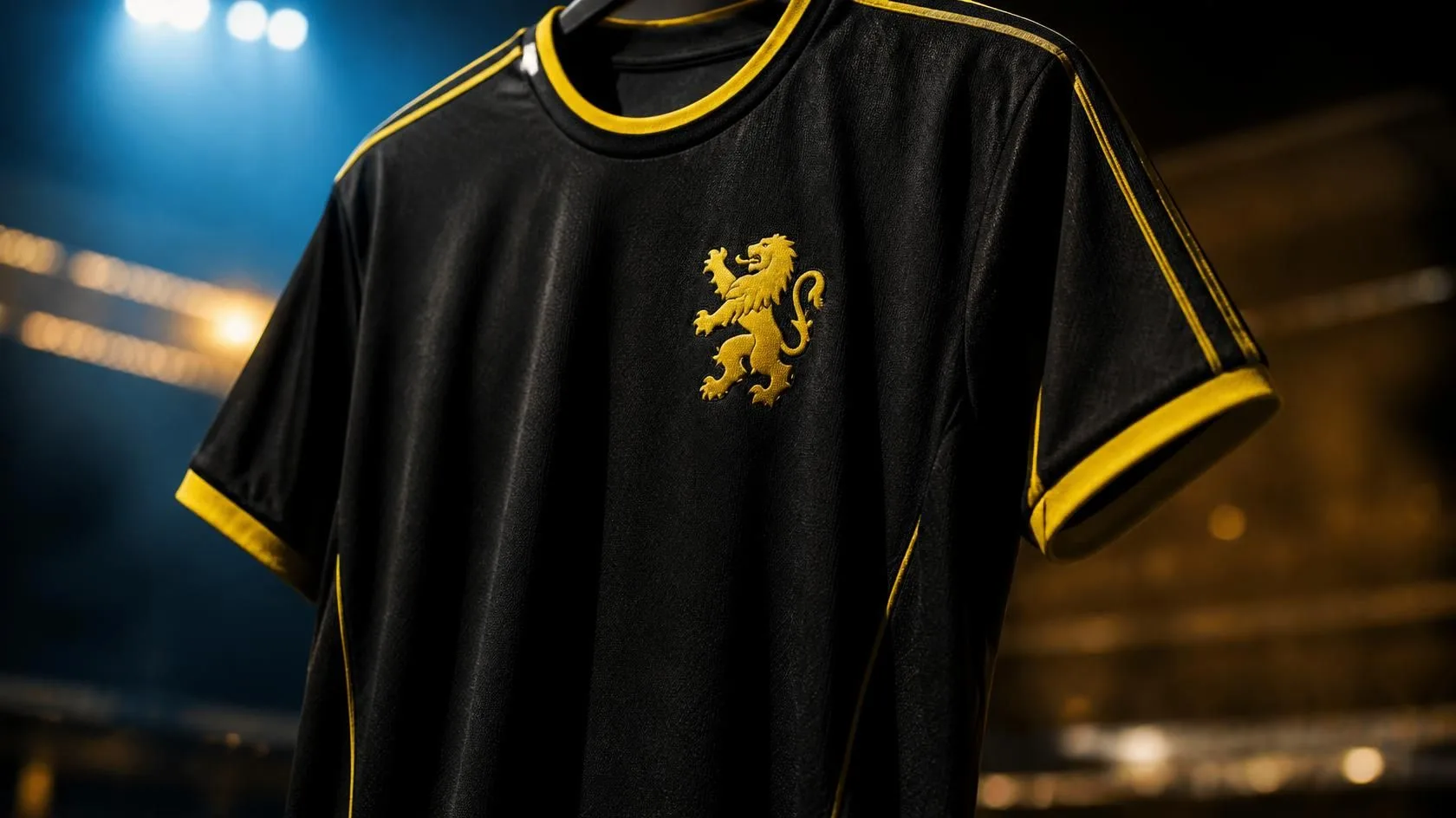
Football fans love a good hit of nostalgia. When a massive club digs into its archives and revives a classic look, it usually guarantees two things: massive shirt sales and endless debate online. Chelsea did exactly that with their latest third kit.
The Blues recently rolled out a striking new design that completely ditches their modern badge. Instead, they resurrected a retro crest. It is a bold move by the club and their kit manufacturer, Nike, and it finally saw action on the pitch during a tricky away fixture against Everton.
The Return of the Retro Crest
If you look closely at the new third kit, the usual circular badge is gone. Replacing it is the roaring lion, a throwback to the crest style Chelsea wore predominantly in the 1980s and 1990s.
It is a stark, minimalist look. The lion stands alone without the surrounding text or borders that define the modern era. The rest of the shirt complements this vintage vibe. The colors mix a punk-inspired black and yellow pattern, which Nike claims pays homage to the fashion culture of King's Road in Chelsea.
But the crest is the real talking point. Fans have been begging for a retro badge for years. It connects the current squad, packed with expensive modern talent, to a grittier era of English football.
The Debut at Goodison Park
A kit reveal is one thing; seeing it under the floodlights is another. Chelsea chose their Premier League clash against Everton at Goodison Park to debut the new look.
Goodison is one of the oldest, most traditional stadiums left in the top flight. It was the perfect backdrop for a retro-inspired shirt. The striking yellow and black pattern stood out sharply against the deep blue of the Everton stands.
Kit debuts are often fraught with superstition. Fans often associate a specific shirt with terrible luck if the team loses its first outing. Fortunately for the marketing department, the players looked sharp. The retro lion on their chests gave off an aggressive, no-nonsense energy.
Why Clubs Are Looking Backwards
Chelsea isn't the only club doing this. We are seeing a massive trend across European football. Clubs are temporarily swapping their primary badges for vintage alternatives on second or third kits.
Arsenal brought back the simple cannon. Manchester United occasionally uses a stripped-back devil. Now, Chelsea has the standalone lion.
The strategy makes perfect sense. Modern club crests are designed primarily for digital screens and global branding. They are clean, scalable, and sometimes a bit boring. Retro crests hit an emotional nerve. They remind older fans of their youth and give younger fans a sense of history.
This trend isn't just about fashion; it is a financial strategy. Tapping into nostalgia is incredibly lucrative. When Manchester United faced their financial charges last season, their commercial wing kept churning out retro merchandise because it sells relentlessly. Chelsea is simply playing the same smart commercial game.
A Hit or a Miss?
Early reactions from the Chelsea faithful have been overwhelmingly positive. The away end at Goodison Park was already dotted with fans wearing the new shirt.
Will this retro lion become a permanent fixture? Probably not. Modern branding demands consistency, and the current circular badge is recognized globally. But as a change of pace for away trips, the retro crest is a massive win.
Comments (0)
Keep exploring
Related posts
 Sports
Masai Russell Shatters Tobi Amusan 100m Hurdles Record
 Sports
FIFA and CAF Suspend Nigeria Football Elections After Resignations
 Sports
Man Utd Guilty on 114 Financial Charges? The Truth
 Sports